
Why you should get a Wedding Videographer Writen By Bobby Doyle Videographer Why you may want to hire a professional
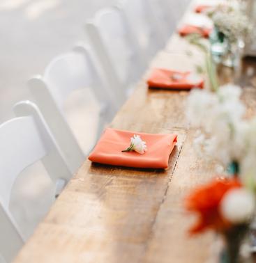
The Wedding Party Rehearsal You may be wondering why ceremonies require rehearsals. True, you’re not putting on a Broadway show,

Share on facebook Share on pinterest Share on twitter Share on linkedin Chalk another one on the board for the
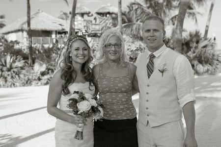
Why you may want to book your officiant early Share on facebook Share on pinterest Share on twitter Share on

Share on facebook Share on pinterest Share on twitter Share on linkedin What is the Keys Disease? The Keys Disease
Share on facebook Facebook Share on pinterest Pinterest Share on twitter Twitter Share on linkedin LinkedIn Share on reddit Reddit
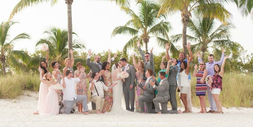
Whether you are planning or attending a beach wedding, it is a common question to ask, what do I wear?

Share on facebook Share on google Share on twitter Share on linkedin Building Your Wedding Vendor Timeline Planning a wedding
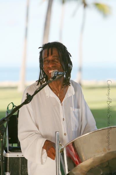
Share on facebook Share on pinterest Share on twitter Share on linkedin Destination Weddings – Vendor Checklist There are many